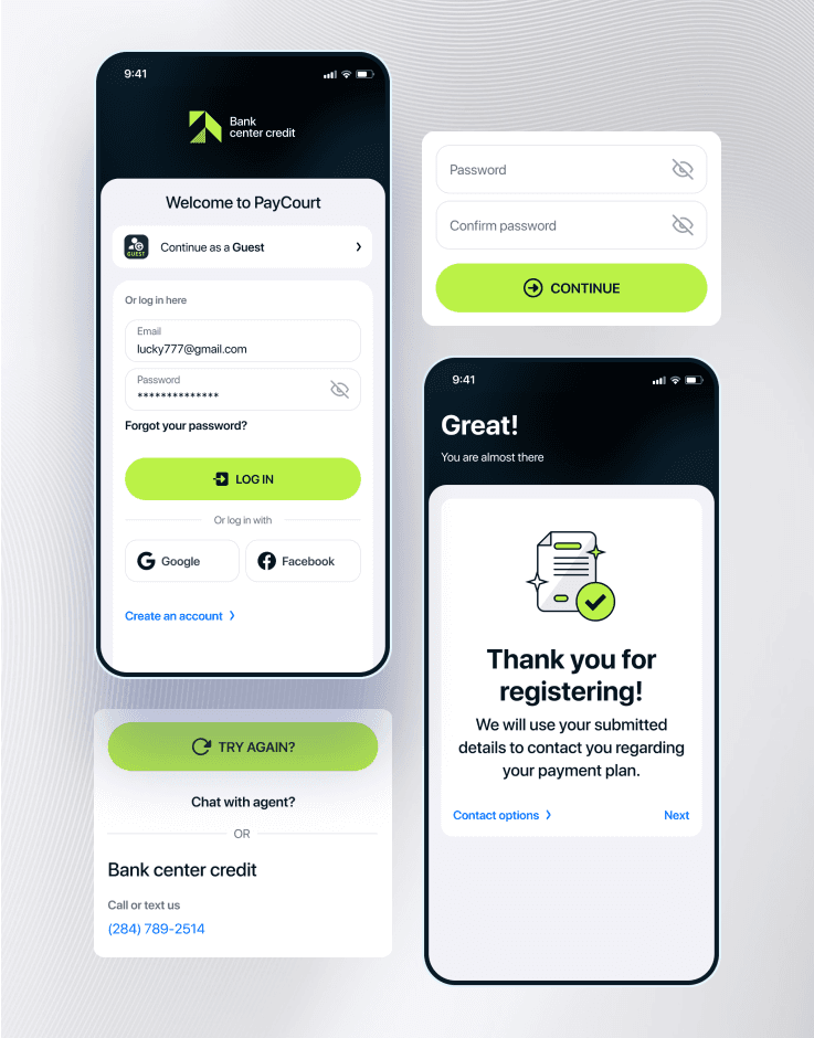
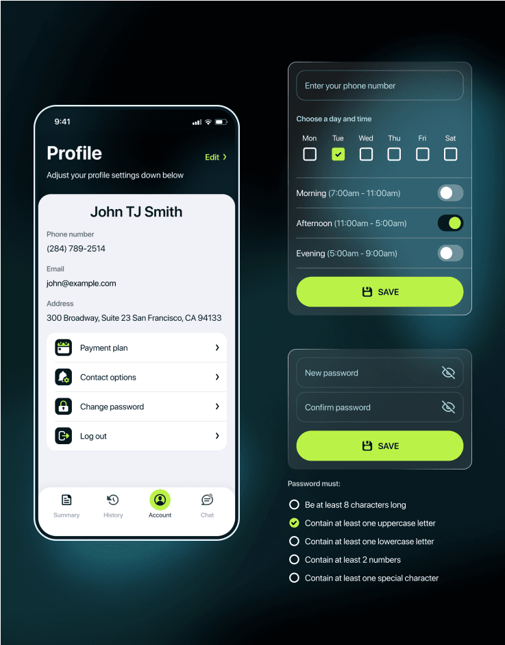
Because of the app specifics, standard registration was something secondary compared to the ability for the user to continue as a guest.
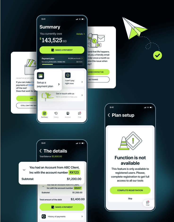
The user clearly sees how much he/she owes and how much has already been paid, sees a payment plan and can modify it. The total balance is broken down to show the details. When additional support is needed, they can always contact the agent to get some help.
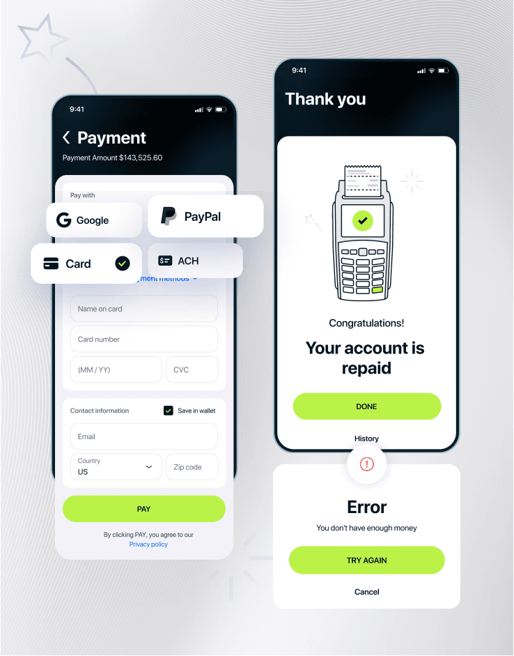
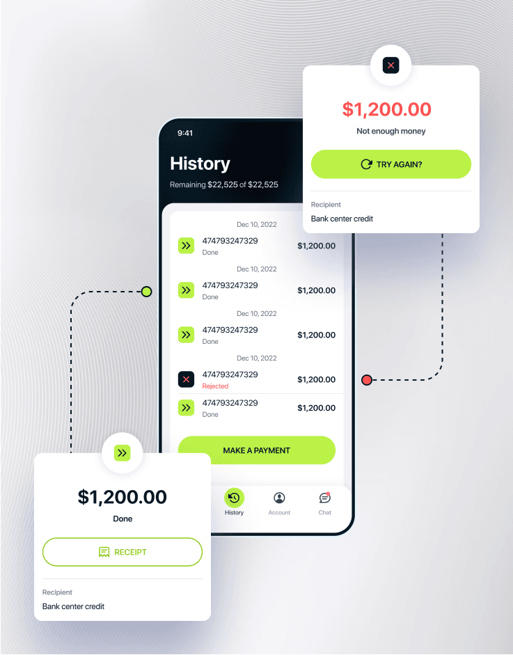
No distractions, just all the options they need to pay out their debt.
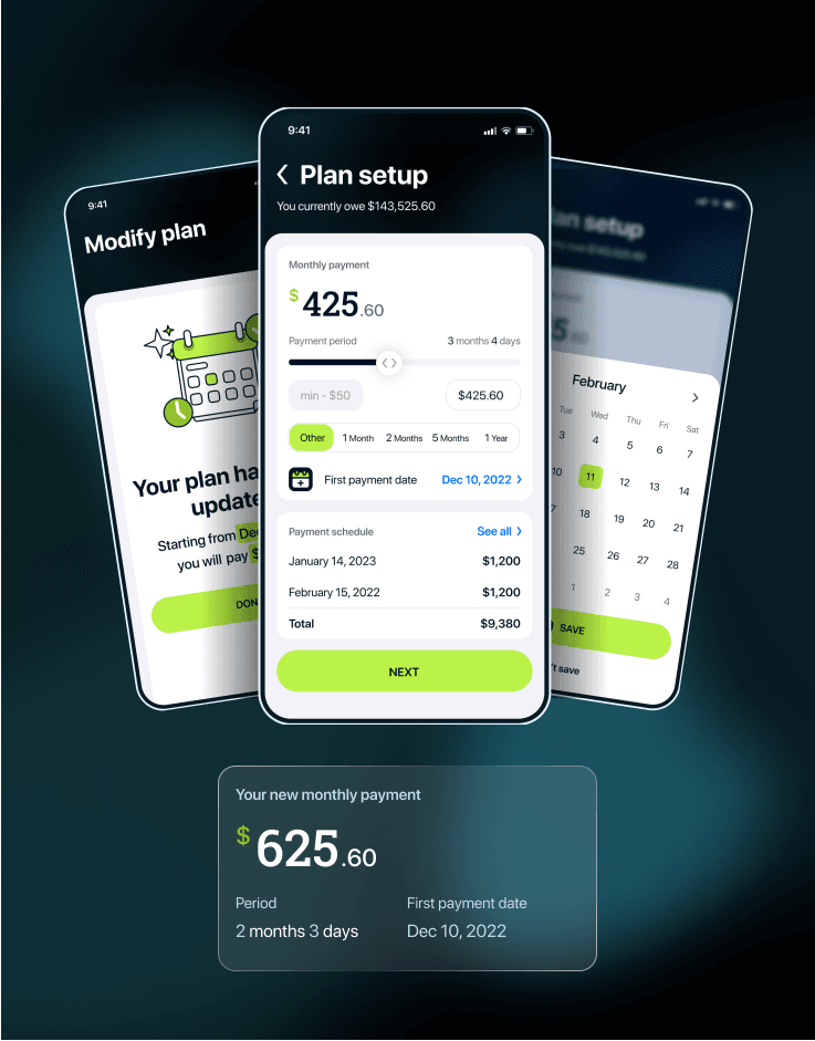
Users are given an option to create a payment plan and adhere to it. Further plan modifications are allowed if needed.
Full transparency and details of every single payment made.
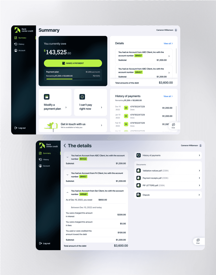
Everything in one place - well-organized and easily accessible.
Web UI version created.
Because of the app specifics, standard registration was something secondary compared to the ability for the user to continue as a guest.
The user clearly sees how much he/she owes and how much has already been paid, sees a payment plan and can modify it. The total balance is broken down to show the details. When additional support is needed, they can always contact the agent to get some help.
No distractions, just all the options they need to pay out their debt.
Users are given an option to create a payment plan and adhere to it. Further plan modifications are allowed if needed.
Full transparency and details of every single payment made.
Everything in one place - well-organized and easily accessible.